How to Design Your Own Website?

Design Your Own Website
How to Design Your Own Website: A Beginner’s Guide
The internet has become an essential part of our lives, and having a website is no longer just for businesses. Whether you’re a creative professional showcasing your portfolio, a musician sharing your music, or simply someone with a passion to find a like-minded community, a website allows you to establish your own space online.
But for beginners, the idea of designing a website can seem daunting. Fear not! This comprehensive guide will walk you through the steps of designing your own website, from conception to launch, and beyond.
1. Define Your Goals and Target Audience: Digging Deeper
Before diving into the design aspects, take a step back and consider your website’s purpose in more detail. What do you want to achieve with it? Are you aiming to:
- Sell products or services (e-commerce)? Consider the user journey – how will visitors navigate your website to find the products they need? How will you integrate a secure and user-friendly payment gateway?
- Showcase your creative work (portfolio)? Focus on creating a visually stunning platform that highlights your skills and experience. Consider including high-quality images or videos of your work, client testimonials, and clear calls to action (e.g., contact me for project inquiries).
- Share your knowledge and expertise (blog)? Prioritize readability and user experience. Optimize your content for search engines (SEO) so potential readers can easily find your blog. Utilize categories and tags to organize your content effectively.
- Build a community around a shared interest? Encourage user interaction through features like forums, comment sections, and member profiles. Foster a welcoming and inclusive environment where users feel comfortable engaging with each other.
- Simply establish your online presence? Even a simple website can be a powerful tool. Craft a compelling “About Us” section that tells your story and explains what you’re passionate about. Include clear contact information so visitors can connect with you.
Identifying your website’s goals will not only guide your design decisions but also influence the content strategy and functionalities you choose to implement.
Next, consider your target audience in more detail. Who are you trying to reach with your website? Understanding their demographics (age, location, occupation), interests, and online behavior will help you tailor your website’s content and design to resonate with them.
Conduct some basic market research to understand your target audience better. Look for online communities or forums where they gather and see what kind of content they engage with.
2. Choose Your Weapon: Website Builders vs. Coding – A Detailed Breakdown
There are two main approaches to website design: using website builders or coding from scratch. Here’s a detailed breakdown of each approach to help you decide which is best for you:
-
Website Builders: These user-friendly platforms offer drag-and-drop interfaces and pre-designed templates, allowing you to create a website without any coding knowledge. Popular website builders include Wix, Squarespace, and Weebly. They are perfect for beginners due to their:
- Ease of Use: The intuitive drag-and-drop interface allows you to visually design your website without needing to write code. Most website builders offer a user-friendly interface with clear instructions and tutorials.
- Affordability: Website builder plans are typically very affordable, especially compared to hiring a professional web developer. Many website builders offer free plans with limited features, allowing you to experiment before committing.
- Scalability: Many website builders offer upgradeable plans that allow you to add more features and functionality as your website grows.
However, website builders also have some limitations:
- Customization: While website builders offer a wide range of templates and customization options, you may not have complete creative control over the design of your website.
- Limited Functionality: Website builders may not offer all the advanced features or functionalities you might need for a complex website.
-
Coding: If you have a strong design vision or require a highly customized website with specific functionalities, coding allows for complete control. However, it requires learning languages like HTML, CSS, and potentially JavaScript. This path has a steeper learning curve but offers greater flexibility:
- Complete Control: With coding, you have complete control over every aspect of your website’s design and functionality. You can create a website that is truly unique and tailored to your specific needs.
- Advanced Features: Coding allows you to implement advanced features and functionalities that may not be available with website builders. This could be anything from a custom e-commerce platform to a membership system.
Here are some additional factors to consider when choosing between website builders and coding:
- Your Technical Skills: If you’re comfortable with technology and are willing to learn new things, coding may be a good option. However, if you’re a complete beginner, a website builder will be a much easier and faster way to get started.
- Your Budget: Website builders are generally more affordable than hiring a professional web developer to code a website from scratch. However, there are ongoing costs associated with website builder plans and potentially additional fees for premium features.
- Your Time Commitment: Building a website from scratch using code takes time and dedication. Website builders offer a quicker and more user-friendly way to get your website up and running.
3. Find Inspiration and Plan Your Layout: Building Your Vision
Once you’ve chosen your approach, it’s time to get inspired! Here are some ways to spark your creativity and develop a clear vision for your website’s design:
- Browse Websites You Admire: Explore websites in your niche or with design elements you find appealing. Pay attention to color schemes, typography, layout styles, and how they use visuals. Take screenshots or create mood boards to collect your inspirations.
- Identify Design Trends: While staying true to your brand identity, consider incorporating some of the latest website design trends. Research popular trends like minimalist design, microinteractions, and the use of bold colors and typography.
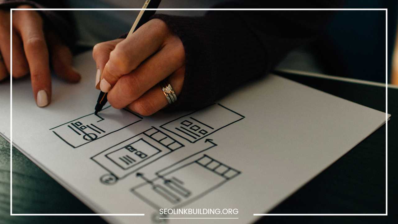
- Sketch Your Ideas: Before diving into the website builder or coding, grab a pen and paper and sketch out your website’s layout. This will help you visualize the overall structure and user flow. Consider how many pages you will need and what content will be on each page.
Website Layout: Websites typically follow a basic structure with key elements:
- Header: This is the first impression for visitors, so make it visually appealing and informative. It typically includes your logo, website name, and potentially a call to action.
- Navigation Bar: This allows visitors to easily navigate between different sections of your website. Ensure clear and concise labeling for each navigation link.
- Content Area: This is the main area where you will display your website’s content (text, images, videos).
- Sidebar (Optional): This can be used for displaying additional information such as a blog feed, social media links, or a call to action.
- Footer: This section is located at the bottom of the page and can include copyright information, contact details, and additional navigation links.
Planning your layout involves considering the type of content you will be including and how users will navigate through your website. Here are some common website layouts to consider:
- One-page website: Ideal for simple websites with concise and focused information.
- Landing page: Designed for a specific call to action, such as subscribing to a newsletter or purchasing a product.
- Multi-page website: Suitable for more complex websites with various sections (e.g., About Us, Contact, Blog). Consider a hierarchical structure with clear navigation to guide users to the information they seek.
4. Pick a Domain Name and Web Hosting: Your Digital Address
Your domain name is your website’s address on the internet (e.g., “[yourwebsitename].com”). Choose a name that is:
- Relevant: It should reflect your website’s purpose and brand identity.
- Memorable: Make it easy for visitors to remember and type.
- Brandable: Ideally, it should be aligned with your business name or personal brand.
Here are some tips for choosing a domain name:
- Keep it short and sweet.
- Use keywords relevant to your website’s content.
- Avoid hyphens and underscores if possible.
- Make it easy to pronounce and spell.
- Check for availability of the domain name with different extensions (.com, .net, .org).
Web hosting is the service that stores your website’s files and makes it accessible online. Reliable web hosting ensures your website loads quickly and is always available to visitors. Here are some factors to consider when choosing a web hosting provider:
- Reliability: Uptime is crucial. Choose a web hosting provider with a proven track record of reliability and minimal downtime.
- Storage and Bandwidth: Consider the amount of storage space and bandwidth you’ll need based on the size and complexity of your website.
- Security Features: Choose a web hosting provider that offers security features to protect your website from malware and hacking attempts.
- Customer Support: Ensure the web hosting provider offers reliable customer support in case you encounter any technical issues.
5. Content is King: Craft Engaging Content That Connects
High-quality content is what keeps visitors engaged on your website and coming back for more. Here are some key aspects to consider when crafting your website’s content:
-
Written Content: Focus on clear, concise, and informative writing tailored to your target audience.
- Website Copy: This includes everything from your homepage content to product descriptions and blog posts. Use a conversational tone and avoid overly technical language.
- SEO Optimization: Consider incorporating relevant keywords throughout your website’s content to improve search engine ranking. However, prioritize user experience over keyword stuffing.
-
Visual Content: Images, videos, and infographics can significantly enhance your website’s visual appeal and break up text-heavy sections. Here are some things to keep in mind:
- Quality: Use high-resolution images and videos that are visually appealing and relevant to your content.
- Optimization: Optimize image file sizes to ensure fast loading times.
- Accessibility: Include alt text descriptions for images to improve accessibility for visually impaired visitors and search engine optimization.
Here are some additional content strategies to consider based on your website’s goals:
- E-commerce Website: Provide detailed product descriptions, high-quality product images from different angles, and customer reviews. Consider including clear calls to action (e.g., “Add to Cart”) and a user-friendly checkout process.
- Portfolio Website: Showcase your best work with high-quality images or videos. Include client testimonials and clear contact information.
- Blog: Publish informative and engaging blog posts that address your target audience’s interests and pain points. Maintain a consistent publishing schedule and promote your blog posts on social media.
- Community Website: Create a platform for user interaction through forums, comment sections, and member profiles. Encourage users to share their thoughts and experiences.
6. Design with Usability in Mind: A User-Friendly Experience
Usability is paramount for any website. Here are some key principles to follow for creating a user-friendly website:
- Navigation: Make it easy for visitors to find what they’re looking for. Use clear and concise navigation menus with well-labeled links. Consider a mega menu for complex websites with many pages.
- Mobile-friendliness: Ensure your website looks good and functions flawlessly on all devices, especially smartphones and tablets. Most website builders offer mobile-responsive templates that automatically adjust to different screen sizes.
- Readability: Choose fonts that are easy to read on various screen sizes. Maintain sufficient contrast between text and background colors. Use headings and subheadings to break up your content and improve readability.
- White Space: Don’t clutter your website with too much information. Use white space effectively to create a visually appealing and balanced layout.
- Call to Action (CTA): Tell visitors what you want them to do next. Whether it’s subscribing to your newsletter, purchasing a product, or contacting you, use clear and concise CTAs throughout your website.
- Accessibility: Design your website to be accessible to everyone, including people with disabilities. Follow web accessibility guidelines (WCAG) to ensure your website is usable by people with visual, auditory, or motor impairments.
7. Launch Your Website and Beyond: Success Lies in Optimization
Once you’re happy with your website’s design and content, it’s time to launch it to the world! Most website builders offer a simple one-click publishing process. Here are some additional steps to consider after launching your website:
- Promote Your Website: Utilize social media, email marketing, and online directories to drive traffic to your website.
- Analytics and Optimization: Track your website’s traffic and user behavior using website analytics tools like Google Analytics. Use this data to identify areas for improvement and optimize your website for better performance.
- Security: Maintain strong website security by keeping your website software and plugins updated and implementing strong passwords. Consider obtaining an SSL certificate to encrypt communication between your website and visitors.
- Maintenance: Regularly update your website with fresh content, fix any broken links, and ensure everything functions smoothly.
By following these steps and continuously optimizing your website, you can create a successful online presence that achieves your goals and resonates with your target audience. Remember, your website is a living document, so don’t be afraid to experiment and make changes based on your learnings and audience feedback.


